We are happy to offer you a very useful guide to ensure that you choose the right colors for your merchandise apparel.
by Merle van Wieringen on 12-Apr-2021
4 mins read
If you’ve finally made the decision and decided to design merchandise for your specific purpose, then we understand that designing the apparel is certainly one of the nicest parts of the process. Although you probably already have certain ideas in mind, we are happy to offer you a very useful guide to ensure that you choose the right colours for your products. The last thing we want is that the expectations of your customers do not match the actual product of course. This guide will prevent your merchandise from becoming a new example of the “expectations v.s reality” memes. Nevertheless, you always remain the designer in charge, this only serves for a small support.
The basics of the colour theory
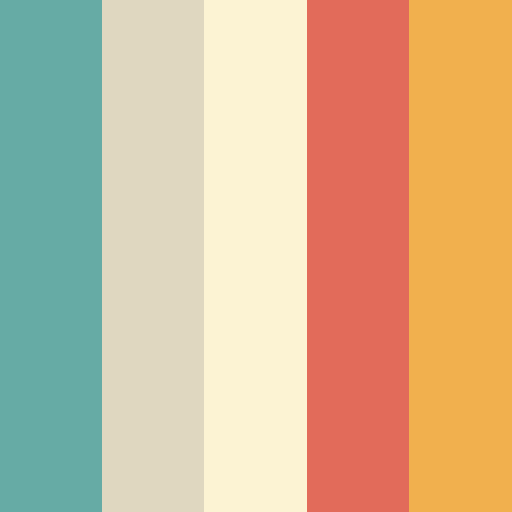
Let’s start from the beginning and that contains, in this case, understanding the basics of the colour theory. You may vaguely remember this from high school, but to refresh your memory, we start with the colours red, blue and yellow that serve as primary colours. These are the basic colours and with these particular colours you should be able to mix any colour. If you mix red and yellow, you get orange; when mixing blue and yellow, you get green; and if you mix red and blue, you get violet. Orange, green and violet are therefore called secondary colours.
You are now probably curious about the specific colour combinations that you can use to design your merchandise. These basic rules are actually very easy and we have listed them for you:
Complementary colours: these are colours that are exactly opposite each other such as red and green, or orange and blue. The contrast between these colours is big so use this combination if you want something to stand out.
Analogous colours: these are any three colours next to each other on the wheel. For example, red, orange and red-orange. Using these colour scheme creates a rich, monochromatic look.
Triadic colours: triadic colours are any three colours that are equally apart on the color wheel. An example of this is blue, red and yellow. This scheme also contains a high contrast though the trick here is to let one color dominate and accent with the other two.
Split complementary and tetradic colours: this is considered the most difficult scheme because it uses four different colours. You should choose a color to be dominant or subdue the other colours. Avoid using pure colours in equal amounts.
Now that you have absorbed the basic rules of color matching, it is also important to realise that colours can trigger emotions in people. Warm colours often bring energy and joy, and cold colours bring calmness and tranquility. If you are interested in more information about color psychology, you should read this article “Color Psychology: How Color Meanings Affect Your Brand”
Before you get started we looked up some examples of t-shirts from previous campaigns to get you inspired.
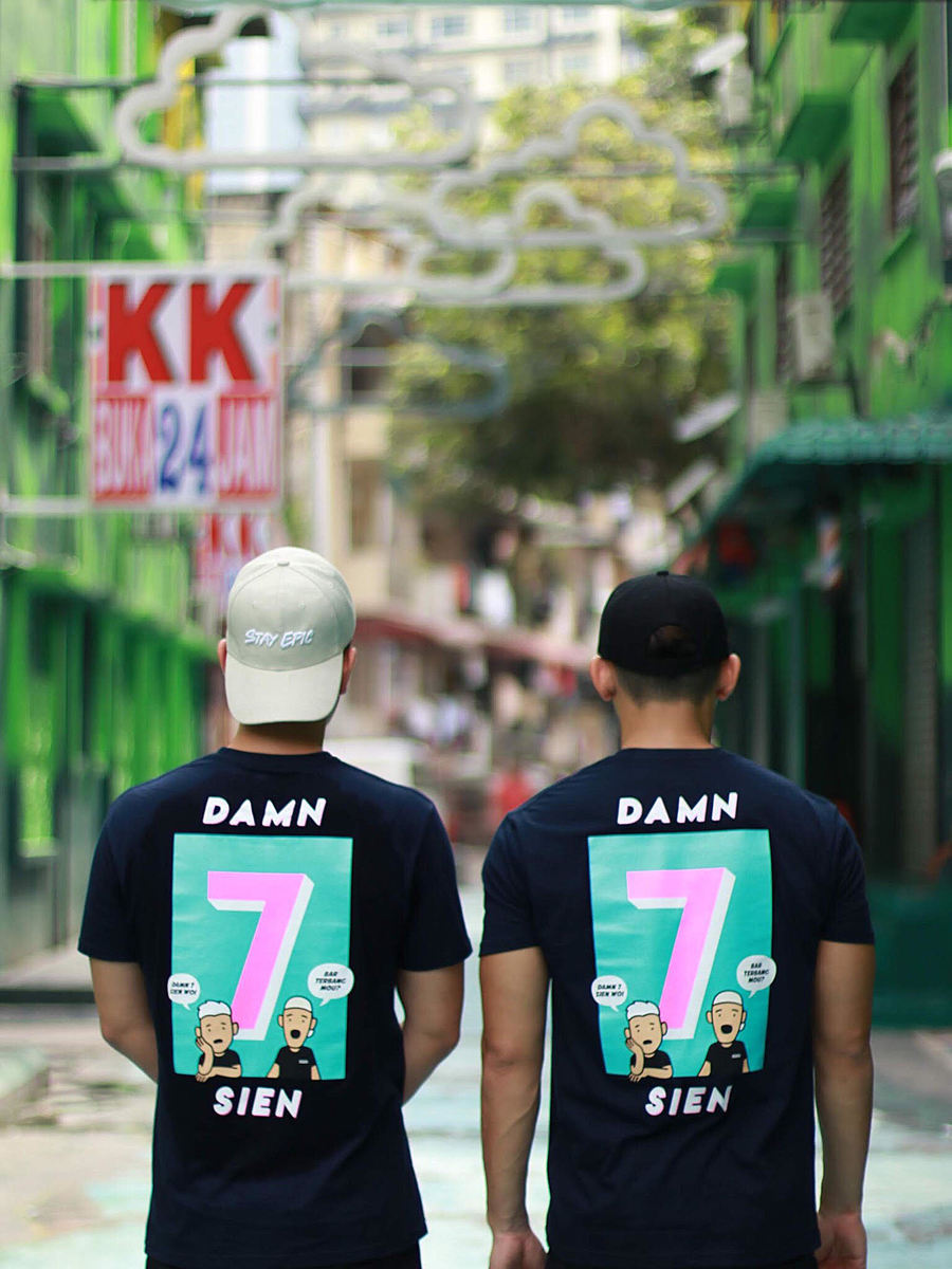
The first example concerns a dark blue t-shirt that uses multiple eye-catching colours. For example, the colour pink, light blue and skin colour are used. Because many different colours have been used, the t-shirt can be connected to the tetradic colours scheme.
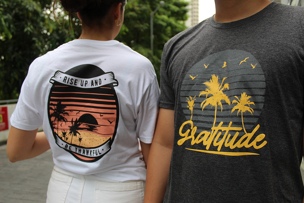
The second example contains a white t-shirt and a grey t-shirt respectively, but this time matched with only 2 or more colours. This t-shirt model can therefore be linked to the split complementary scheme.


